BlendEd
Creating a mobile version for a site that improves how class syllabi are viewed and managed.

Overview
BlendEd is a site that gives professors a better way to share their syllabi with students.
Problem Statement
While BlendEd had carefully developed professors’ view of their site, the student view needed work. For the student view, there needed to be a better understanding of student needs, and a more functional mobile site that wouldn’t force students to spend a lot of time scrolling through a long list of assignments.
Project Scope
This project aimed to gain a better understanding of students’ syllabi needs and to create and test a mobile version of BlendEd for students. The end result was a high fidelity interactive prototype.
Roles and Responsibilities
I served as one of three UX/UI designers for this project. I contributed to almost every step of the project, including conducting competitive research independently, working on sketches, and the mid and high fidelity prototypes.
Defining the User
BlendEd’s target audience is college professors and students. They wish to appeal to both professors who struggle with tech and students who love using tech and innovative sites to help them manage their class work. This means that BendEd needs to be simple for professors to use while still having enough innovative features to appeal to more tech savvy students.

Competitors Research
A competitive analysis was performed on four sites: Unicycle, Moodle, My Study Life, and Springboard. This analysis aimed to learn how competitors address the issue of making their mobile sites easy to use and if they include any features that would be worth incorporating into BlendEd.
There were several main takeaways from this analysis. First, competitors make their sites easier to view on mobile by breaking the syllabus down into separate pages so that students can quickly navigate to the section they are interested in exploring. Second, competitor sites greatly benefit from having some sort of dashboard page that displays assignments for the week and progress bars tracking students’ work. Lastly, competitors included a few interesting features that might be worth incorporating into BlendEd such as allowing students to create accounts, make notes on assignment details, and see a calendar view of assignments.
These features were all kept in mind when designing BlendEd’s mobile site, with the top priorities being breaking the syllabus down into separate pages and creating a great dashboard.

User Interviews
Fifteen minute user interviews were performed over zoom with five students. These interviews aimed to learn about how students typically interact with class syllabi and what problem areas they have in this interaction.
These interviews revealed that students struggle with viewing syllabi on mobile. They get frustrated by the long process of pulling up a syllabi and scrolling through a long list of assignments to get to the current week and find that navigating a long list makes it difficult for them to quickly plan their week.
These interview results suggest that breaking the syllabi into small sections to prevent lots of scrolling should be prioritized and students would appreciate a faster way to view their upcoming assignments when planning out their week.

Affinity Map
An affinity map was created by writing points from the user interviews on post-its and placing them in groups as they seemed to naturally fit. These groups were then assigned appropriate titles.
This exercise helped organize information from the interviews and pull out common themes. It also became a resource to refer back to throughout the design process to ensure design decisions were rooted in user needs.
This exercise helped emphasize users’ frustrations with viewing syllabi on mobile and their struggles to use syllabi for weekly planning.

How Might We Statements
How Might We statements were written on post-its to brainstorm different ways BlendEd might support users. Several statements were then picked out as main points to focus on when supporting users through BlendEd’s design. These points included, how we might allow users to focus on urgent information and how we can help them plan their week.

Journey Map
After gaining an understanding of users’ needs, possible solutions for addressing their needs were brainstormed. A journey map was created depicting possible steps users could take when using BlendEd’s mobile site. After brainstorming several possible journey maps, one was chosen as the path which best met users’ needs. Having a clear understanding of the steps users needed to take when using BlendEd helped provide a starting point for creating sketches.

Sketches
Several sketches were drawn to brainstorm different designs for meeting users’ needs. Positive points were picked out from each of the sketches and through several rounds of sketching, a final set of sketches were developed that included the best points from each of the brainstormed sketches.
Throughout this process, decisions were also made about which features should be developed immediately and which ones should be set aside for a future round of updates. It was decided that features such as an assignment submission spot could be developed later while the helpful dashboard, progress bar, and allowing students to mark assignments as complete should be prioritized.
User Testing: Round One
Usability testing of the sketches was conducted with five students. The tests were performed through zoom. The testing aimed to learn what changes needed to be made to the site’s layout and features before moving into higher fidelity designs.
Usability testing revealed that participants liked the concept of the home page and being able to view a snapshot of the week. However, they wanted the class title to be clearly listed on the home page and a fast way to jump ahead to view future weeks’ assignments. These improvements were made when developing wireframes.

Wireframes
The sketches of BlendEd were transformed into wireframes by using feedback from the usability testing of sketches to make improvements.
The wireframes allowed for the improvements to be evaluated and the layout to be clarified.

Mid Fidelity Prototype
A mid fidelity interactive prototype was created using Figma. This prototype incorporated the layout and features developed through research, sketching, wireframes, and user testing. Creating the prototype also involved developing components and adjusting BlendEd’s style guide to create a mobile appropriate version.
This prototype allowed for the function and style of BlendEd to be more accurately tested with participants in the next round of user testing.

Usability Testing: Round Two
User testing was conducted over Zoom with five graduate students.
The feedback was largely positive. Participants thought BlendEd’s mobile site would make managing assignments far easier and that the site was intuitive and easy to use.
Some small suggestions they had were to add the professor’s name and contact information to the home page and to add a clearer way of showing assignments have been marked as complete.
These improvements were made before finalizing the design.
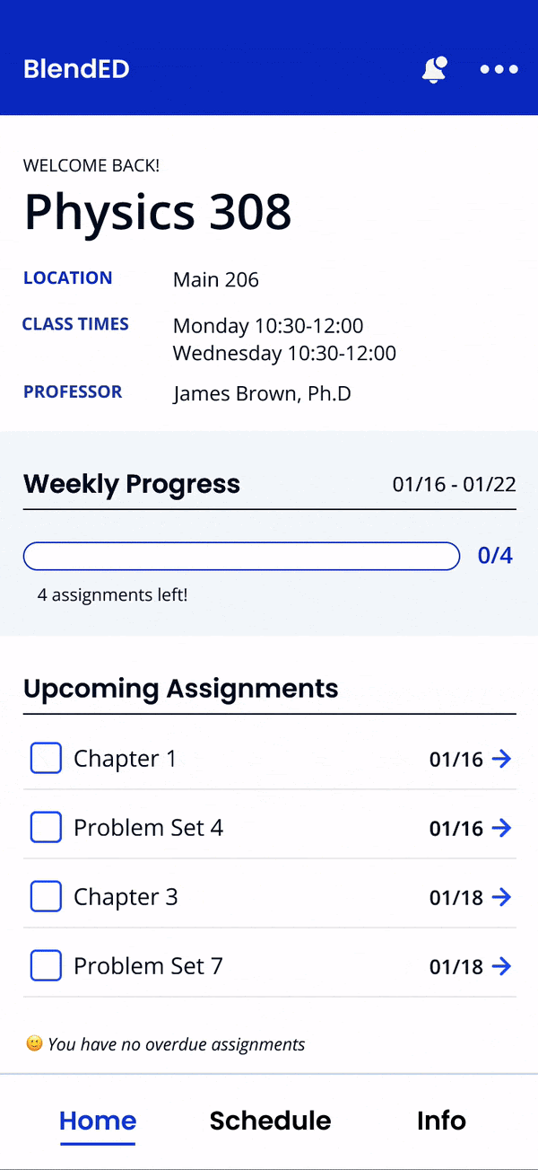
High Fidelity Prototype
Small improvements were made to BlendEd based on the suggestions made by participants during usability testing and the high fidelity prototype was finalized.
Check out BlendEd in the interactive prototype above.
Final Outcome and What's Next
The final result of this project was a polished high fidelity interactive prototype that is based on user needs and successfully addresses students’ main concerns with managing class syllabi on mobile. Having gotten great user feedback on how the new mobile site allows users to easily navigate the syllabus and focus on their week’s tasks, the UX/UI work for this project is complete. The engineering team will now work on implementing the great new design.
Future projects on BlendEd’s mobile site will likely work on incorporating even more of the features that came up during this project’s research and testing that were not practical for implementing immediately. This may include:
1. Allowing students to create accounts
2. Allowing students to submit assignments through BlendEd
3. Adding a sync to calendar feature
In the meantime the UX/UI work on this project is complete and the project was successful in creating an intuitive and helpful mobile site that limits users’ scrolling and incorporates useful features in a way that can be quickly implemented by developers.